1850-1899: Golden Age of data graphics
By the mid-1800s, all the conditions for the rapid growth of visualization had been established. Official state statistical offices were established thoughout Europe, in recognition of the growing importance of numerical information for social planning, industrialization, commerce, and transportation. Statistical theory, initiated by Gauss and Laplace, and extended to the social realm by Guerry (Guerry:1833) and Quetelet (Quetelet:1831), provided the means to make sense of large bodies of data.
What started as the "Age of Enthusiasm" (Palsky:1996) in graphics and thematic cartography, may also be called the "Golden Age", with unparalleled beauty and many innovations.
 Hemholtz1850
 Helmholtz1852-1
 Helmholtz1852-2
 Helmholtz1852-3
 Herman Helmholtz
Discovery of time course of muscle action and nerve impulses by graphical methods.
Helmholtz apparently used a simplified version of a recording device named Kymograph (originally invented by Carl Ludwig), to obtain graphical representation of muscle action after stimulation. "These graphs proved that 'the energy of the muscle does not fully develop at the moment of an instantaneous stimulus, but only gradually increases, most often only after the stimulus has ceased, reaches a maximum, and again disappears" (Holmes and Olesko, 1995)
References:
Helmholtz:1850 Helmholtz:1852 HolmesOlesko:1995
 Pie-map showing origin of meats consumed in Paris
Map incorporating statistical diagrams: circles proportional to coal production (published in 1861)
References:
Minard:1861Statistical graphics used in a lawsuit. (Reported by Ernst Engel at the 7th meetings of the International Statistical Congress, 1869, The Hague
References:
Funkhouser:1937
 Graphic train schedule with map
 Graphic train schedule
An augmented graphic representation of a train schedule for 35 railways stations, between St. Petersburg and Moscow. This was designed by Lt. Sergev in 1854.
References:
Wainer-Harik:2013
 Collapse of the bridge on the Rhone
Minard, a visual engineer, was asked to investigate the cause of the collapse of the bridge at Bourg St. Andeol on the Rhone in 1840.
References:
Tufte:1983
 Composite Map: Sheets 1-9
Visual representation and data visualization of the history of the Emperor Ferdinand Northern railway from the beginning of the operation on the 6th. of January 1838 to the end of the year 1853.
There are 2 years on every sheet, the horizontal scale is the timeline with the major events of the company like the opening of a new part of the track. There is a map of the rail network on every sheet for every year. The vertical scale are the revenues, from the bottom to the top income with passengers, from the top to the bottom income for transport of goods. In the lower right of every year you can see the number of locomotives, close to the center the number of the different wagons:1st class, 2nd class, 3rd class and freight wagons. As a data visualization this is very unusual in the amount of different kinds of data mixed together on one chart, over time. It is also very early for such an ambitious effort.
David Rumsey Map Collection
References:
 Snow portrait
 Cholera map
Use of a dot map to display epidemiological data, leads to discovery of the source of a cholera epidemic.
References:
Snow:1855 Gilbert:1958Discussion of standardization and classification of graphical methods at the Third International Statistical Congress
References:
Congress:1858Exhibition display of graphs and cartograms. Third International Statistical Congress
References:
Congress:1858
![]() re-creation of a coxcomb
re-creation of a coxcomb
 Nightingale coxcomb
 Nightingale portrait
 Coxcomb of Cholera deaths by William Farr
 Coxcomb of London Plague by William Farr
 William Farr portrait
Polar area charts, known as "coxcombs'' (used in a campaign to improve sanitary conditions of army)
Florence Nightingale is often credited with the invention of this form of a polar area chart, however it is likely that she got the idea from William Farr. The earliest known use of this graphic form is by Andre-Michel Guerry in 1829. See the link above.
References:
Nightingale:1857 Farr1852:report
 Galton's 1881 weather chart
 Galton portrait
 1861, Dec.7. Morning, Afternoon, Evening.
 Charts of the temprature, wind, rain and borometer in the morning.
The modern weather map, a chart showing area of similar air pressure and barometric changes by means of glyphs displayed on a map. These led to the discovery of the anti-cyclonic movement of wind around low-pressure areas
References:
Galton:1861
 Maxwell portrait
Invention of the trichromatic process for making color photographs, by taking three monochrome images through red, green and blue filters
References:
 Graphical method, from
 Quantitative induction, from
 Jevons portrait
 The first semilog chart
Semilogarithmic grid (showing percentage changes in commodities)
References:
Jevons:1879 Jevons:1863
 Levasseur portrait
 Zeuner portrait
Three-dimensional population surface or "stereogram,'' with axonometric projection to show curves of various "slices'' (sometimes known as a "Zeuner diagram)''
References:
Zeuner:1869
 Minard's March on Moscow graphic
Minard's flow map graphic of Napoleon's March on Moscow (called "the best graphic ever produced)
References:
Minard:1869a Tufte:1983The periodic table used to classify chemical elements according to their properties, and allowing the prediction of new elements that would be discovered later.
Mendeleev arranged all of the 63 elements, then known by their atomic weights, into groups possessing similar properties. Where a gap existed in the table, he predicted a new element would one day be found and deduced its properties. Three of those elements were found during his lifetime
References:

Use of statistical graphics by USA Government in census reports (cartograms of data from Ninth Census)
References:
Census:1872Classification of statistical graphical treatments by form, with consideration of appropriate uses of color, graphical elements, limitations of perception. At the 8th ISI meetings, St. Petersburg.
References:
Schwabe:1872 Cheysson:1878
 Galloping Horse, 1878
 Galloping Horse, 1878
Recording of motion (of a running horse) by means of a set of glass-plate cameras, triggered by strings
References:
 Gibbs portrait
 Plot on trilinear graph paper by R. A. Fisher, ca. 1955
Graphical methods applied to explain fundamental relations in thermodynamics; this includes diagrams of entropy vs. temperature (where work or heat is proportional to area), and the first use of trilinear coordinates (graphs of (x,y,z) where x+y+z=constant)
References:
Bumstead:1961 Gibbs:1873a Gibbs:1873b
 Loua scalogram of 40 characteristics of 20 Paris districts (2422 x 1932; 1386K)
 Loua scalogram, color version (1212 x 960; 318K)
 Shaded map of Paris showing number of inhabitants per house (935 x 615; 77K)
First-known use of a semi-graphic table to display a data table by shading levels
Loua used this as a graphic summary of 40 maps of Paris, each showing some feature of the population by arrondisement. This device was later used by Bertin who also considered ways of reordering the rows and columns (the "reorderable matrix'') to make the pattern of high/low values more apparent.
References:
Bertin:1967 Loua:1873
![]() Population pyramid
Population pyramid
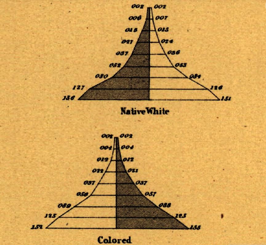 Example of population pyramid
Age pyramid (bilateral histogram), bilateral frequency polygon, and the use of subdivided squares to show the division of population by two variables jointly (an early mosaic display) in the first true U.S. national statistical atlas
References:
Walker:1874
 Vauthier portrait
 Estuaire de la Seine en 1834
 Vauthier contour map
![]() Vauthier contour map
Vauthier contour map
Population contour map (population density shown by contours), the first statistical use of a contour map
References:
Vauthier:1874Two-variable color map (showing the joint distribution of horses (red, vertical bars) and cattle (green, horizontal bars) in Bavaria, widths of bars $sim$ animals/km$^2$)
References:
vonMayr:1874
 Galton correlation diagram, from
Galton's first semi-graphic scatterplot and correlation diagram, of head size and height, from his notebook on Special Peculiarities
References:
Hilts:1975
 Lexis diagram
Lexis diagram, showing relations among age, calendar time, and life spans of individuals simultaneously (but the paternity of this diagram is in dispute cite{Vandeschrick:2001})
References:
Lexis:1875
 Galton's first correlation diagram
Galton's first illustration of the idea of correlation, using sizes of the seeds of mother and daughter plants
In 1875, Galton was interested in the inheritance of size in sweet-pea seeds, but appears to have tried with smaller seeds first, apparently that of cress. The isograms are represented by ink lines on the sheet of glass covering the little compartments which contain the ranked seeds of the daughter-plants.
References:
Pearson:1914 Pearson:1914
 Galton's 1877 machine
Galton's 1877 (hypothetical) machine for visualizing Bayesian inference using a prior distribution.
References:
Stigler:2011
 von Mayr's Area diagram
 von Mayr portrait
 Mosaic graph by Von Mayr
First use of proportional, divided square in the modern (mosaic) form for data representation
References:
vonMayr:1877
 von Mayr's polar diagram
First use of polar diagrams and star plots for data representation
References:
vonMayr:1877 Ostermann:1999
 Early regression of height on weight for English schoolboys
 Early regression curves of height on weight for Boston schoolboys
Extensive statistical study of 24,500 children to improve school practice; early ideas of correlation and regression by quoting the "measure of stoutness'', the ratio of annual increase in pounds weight to annual increase in inches height. Includes six charts, showing curvilinear regresions.
Separate series of graphs showing the regression of height (or weight) on age and weight on height
References:
Bowditch:1877 Walker:1929 Walker:1929
 Marey portrait
First attempt to survey, describe, and illustrate available graphic methods for experimental data
References:
Marey:1878
 Sylvester portrait
![]() Sylvester's diagram icon
Sylvester's diagram icon
The term "graph'' introduced, referring to diagrams showing analogies between the chemical bonds in molecules and graphical representations of mathematical invariants (also coined the term "matrix'')
References:
Sylvester:1878
 Perozzo stereogram image
 Perozzo ilustration of systems for 3D representation
![]() Perozzo stereogram icon
Perozzo stereogram icon
Stereogram (three-dimensional population pyramid) modeled on actual data (Swedish census, 1750--1875)
References:
Perozzo:1880Album de Statistique Graphique, an annual series over 20 years, using all known graphic forms (map-based pies and stars, mosaic, line graphs, bar charts, and, of course, numerous flow maps) to depict data relevant to planning (railways, canals, ports, tramways, etc.) [This series, under the direction of Émile Cheysson, is regarded as the epitome of the "Golden Age of Statistical Graphics'']
References:
Album:1879 Palsky:1996
 Venn diagram
 Venn portrait
 Somersault image sequence
![]() Somersault icon
Somersault icon
Invention of precursor of motion-picture camera, recording a series of photographs to study fight of birds, running and walking
References:
Marey:1873
 Bertillon portrait
Statistical reasoning employed to create a new system of bodily measurement, specifically for identifying criminals
References:
Patent issued on logarithmic paper (reported to the British Association for the Advancement of Science, in 1898). Also called "semi-log,'' "arith-log'' paper and "ratio charts''
References:
Vincent:1898
 Lallemand's "L'Abaque Triomphe''
Combination of many variables into multi-function nomograms, using 3D, juxtaposition of maps, parallel coordinate and hexagonal grids (L'Abaque Triomphe)
Lallemand was director of the "Service de nivellement de la France,'' designed to establish the heights of locations, water levels and tides throughout France, taking geodetic measurement to the third dimension. He also served as Inspector General of Mines.
References:
Lallemand:1885
 Mulhall pictogram image
 Mulhall pictogram image, steam power (730 x 457; 52K)
 Man, animal and machine pictogram
 Mulhall pictogram image, railways (726 x 456; 58K)
 Hollerith punched card
 Hollerith portrait
 Hollerith punched card machine: reader-sorter
Invention of the punched card for use in a machine to tabulate the USA Census (in 1890). Hollerith's company eventually became IBM
References:
![]() Traction of a locomotive in three coordinate systems
Traction of a locomotive in three coordinate systems
 Diagram of parallel coordinates from
The first alignment diagrams, using sets of parallel axes, rather than axes at right angles; development of the essential ideas used in parallel coordinates plots. [Using the principle of duality from projective geometry, d'Ocagne (1885) showed that a point on a graph with Cartesian coordinates transformed into a line on an alignment chart, that a line transformed into a point, and, finally, that a family of lines or a surface transformed into a single line cite(Hankins:1999)]
Diagrams with parallel axes had been used before, notably in the 1870 Statistical Atlas of the United States by Francis Walker. For example, Plate 97 shows mortality of different racial and national groups according to age and disease categories.
References:
Ocagne:1885 Ocagne:1899 Hankins:1999
 Abbott portrait
A literary description of life in a two-dimensional world for people living in a 3D world. By analogy and extension, it suggests the possibile views of fourth and higher dimensions
References:
Abbott:1884
Galton diagram of bivariate normal distribution
 Galton portrait
Normal correlation surface and regression, the idea that in a bivariate normal distribution, contours of equal frequency formed concentric ellipses, with the regression line connecting points of vertical tangents
References:
Galton:1885
 Four type of graphs illustrated by Levasseur
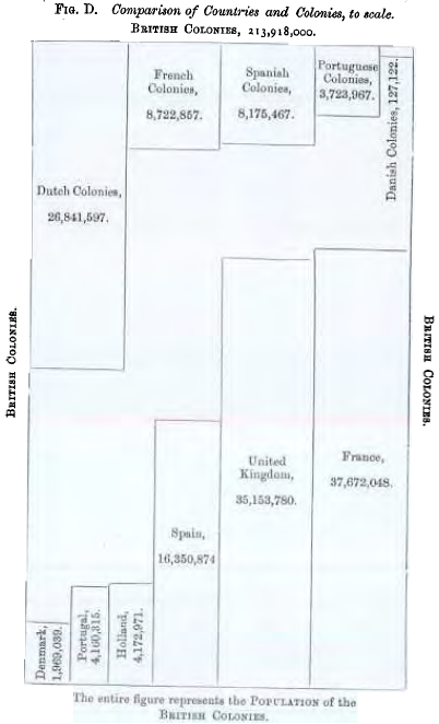 Area diagram comparing populations of countries to their colonies
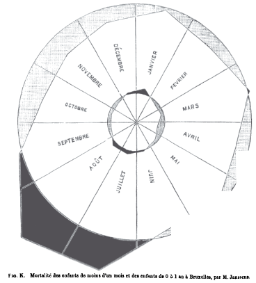 Circle diagram of Infant mortality by month in Brussels
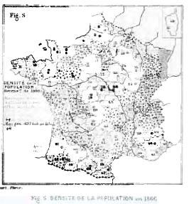 Population density in France in 1866
Comprehensive review of all available statistical graphics presented to the Statistical Society of London, classified as figures, maps, and solids (3D), perhaps the first mature attempt at a systematic classification of graphical forms
References:
Levasseur:1885
 Train schedule graphic
 Marey portrait
Graphic representation of a train schedule showing rate of travel along the route from Paris to Lyon. The method is attributed to the French engineer Ibry, but new evidence suggests that Lt. Sergeev had developed this method approximately 30 years earlier in Russia.
References:
Marey:1885 Tufte:1983
 Cheysson portrait
 Several concentric versions of France representing relative travel time
First anamorphic maps, using a deformation of spatial size to show a quantitative variable (e.g., the decrease in time to travel from Paris to various places in France over 200 years)
References:
Palsky:1996
 Booth portrait
 Booth's poverty map, larger
 Portion of Booth's poverty map
Street maps of London, showing poverty and wealth by color coding, transforming existing methods of social survey and poverty mapping towards the end of the nineteenth century
Charles Booth's work is a classic in several fields of social science, including sociology, urban studies, public administration, policy research, social surveys, demography and geography
References:
Booth:1889 Booth:1889a
 Geddes portrait
Social data, diagrams, including regional survey, incorporated in museum
References:
 Lumiere brothers portrait
First movie, with the cinématographe, using the principle of intermittent movement of film (16 fps), but producing smooth projection (first public film screening on December 28, 1895 at the Cafe Grand)
References:
 Bertillon map
Use of area rectangles on a map to display two variables and their product (population of arrondisements in Paris, percent foreigners; area = absolute number of foreigners)
References:
Bertillon:1896 Palsky:1996Idea for "log-square'' paper, ruled so that normal probability curve appears as a straight line