DataVis.ca
Michael Friendly
York University

Darts |
|---|
 Have Something to Say
More generally, if you have something to say, you need to think clearly about how to say it most directly, in graphs as well as in words.
| Picture | Words |
|---|---|
 |
Art or Artifice? Full size
(197x336) [6K].
As a substitute for substance, one can try lots of color, 3D effects, or disguised redundancy. This graph uses all three techniques, to display just five numbers. Note the clever use of mirror-imaging -- the top series is just (100 - the bottom series) and the interesting use curved lines, front and back to avoid the appearance that there's a lot less here than meets the eye. Tufte (1983, p.118) says, "This may well be the worst graphic ever to find its way into print." An alternative version presents the five numbers as a dot chart. |
 |
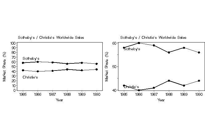
The march of pies... Full size (743 x 497; 57K).
This image, from the graphic design book, Diagraphics II, attempts to show the relative market shares of Sotheby's vs. Christies over time. The graphic designer has cleverly used a variety of tricks to show.... What? Well, it does make clear that time is increasing over time. But there surely isn't much else going on. |
") |
... revised Full size (665 x 445; 4.7K).
If the designer was trying to compare market share of Sotheby's and Christie's over time, the most straight-forward plot would be a time-series graph. But perhaps he/she avoided the use of mirror-imaging shown in the first example. This does make clear that there was relatively little change, except that the gap had narrowed, ever so slightly. But hey--- all is not lost. The graphic designer can still giggle the scales. Here are two alternative scalings for the vertical axis. |
 |
Choose the right graphic form ... Full size (716 x 476; 61K).
This image came from a report by the Office of the Actuary of the Department of Health and Human Services. The presentation goal was to compare the share of gross domestic product (GDP) spent on health care in the US with that of other OECD countries. The analyst chose a scatterplot of Health GDP vs. Country, so the horizontal axis is mysteriously unlabeled, but the software arranged the countries in alphabetical order. Moreover, the vertical axis is started at zero, which compresses the range of the data into the upper half. As a result, the graph is perplexing, and doesn't convey directly what the analyst intended. |
") |
... revised dotchart, sorted
by % GDP (3224 x 2655; 123K); dotchart, sorted by country (3224 x
2655; 123K); R source for these
images.
For this application, a dotchart, with country names on the vertical axis and % of GDP spent on health on the horizontal is much more useful, because it moves the country names outside the plot frame and makes the Country dimension explicit. The version sorted by % GDP makes it abundantly clear that the U S. has by far the greatest share of GDP spent on health care. Neither the original report, nor the graphic suggests why the U.S. is such an outlier, but the reasons are quite well-known to anyone involved in health economics. |
|
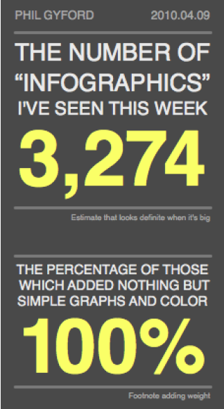
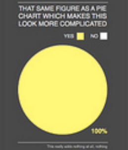
Informationless infographics
Full size (323 x 589; 84K);
As a pie chart (259 x 303; 54K)
Description: This image is a small part of a visual parody in Phil Gyford's Flickr post on InfoVis graphics which are devoid of any content. There are many reasons to use a chart, diagram or infographic just for the sake of having a graphic. Newspapers and magazines, covering a story involving numerical information will often have a side bar or textbox labeled "By the Numbers," similar to this image, where the goal is only to attract the reader's attention. That's OK. Just don't try to present it as a pie chart, or pretend that it is an InfoGraphic.
[Credits:I first saw this in Hadley Wickham's paper,
Graphical criticism: some historical notes,
a response to a paper by Gelman and Unwin on Infovis and Statistical Graphics.
]
|
|
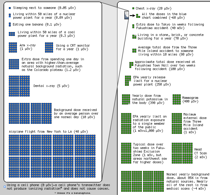
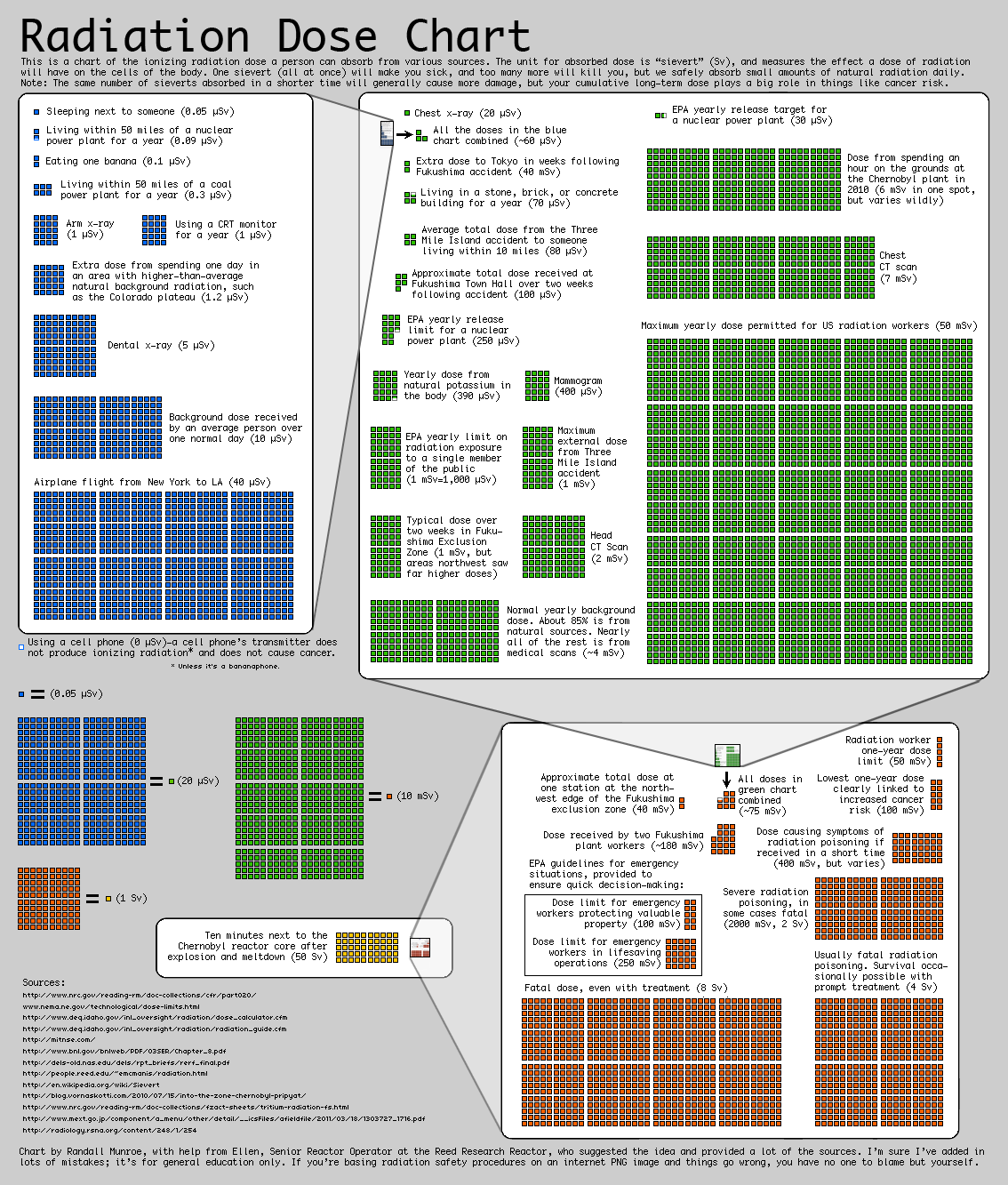
High-information infographics
Full image (1134 x 1333; 90K);
Screenshot1 (314 x 314; 5.9K);
Screenshot2 (709 x 657; 31K)
Description: In contrast to the empty infographic above, this image, from Randal Munroe's xkcd webcomic site attempts to show something serious in an infographic -- the levels of an ionizing radiation dose a person can absorb from various sources, and put them in perspective over many scales, with descriptions of what a given value means. The unit in the chart is the "sievert" (Sv), the effect a dose of radiation will have on a human body. The chart spans many orders of magnitude, from Sleeping next to someone (0.05 μSv), to a chest x-ray (20 μSv), to a fatal dose, even wih treatment (8 Sv), and finally to the dose from 10 minutes next to the Chernobyl reactor after meltdown (50 Sv). The full image is an attempt to convey what might be shown by zooming in an interactive graphic in a single static graphic with callouts and scales. For example, in Screenshot2 , a small icon near the top of the right panel shows the total combined doses (60 μSv) of all the items in the blue sub-chart at the left, [Credits:
Thanks to Randal Munroe, for his wonderful xkcd comics and for putting his stuff in the public domain.
]
|
