DataVis.ca
Michael Friendly
York University

 How to Lie with Maps
Thematic maps try to go further--- to show something else on a map that goes beyond simple geography: Agricultural products, disease incidence, troop movements, trade flows, etc.
| Picture | Words |
|---|---|
|
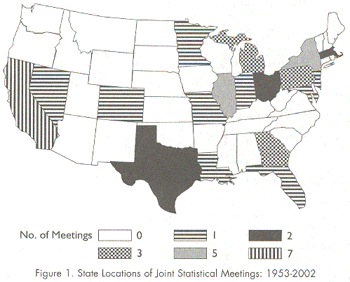
Texas First: Area and Encoding Biases in Maps.
Full size (499 x 402; 35K)
(from AmStat News, May, 2003, #311, p. 2)
It is a challenge to draw maps showing a response or outcome variable in each geographical region, because two features create potential traps that can lead to misunderstanding and bias: (1) area bias: regions with large areas (e.g., Texas) tend to appear, well, larger; conversely, regions with small areas (e.g., Rhode Island) can get lost. (2) encoding bias: different visual encodings are appropriate for depicting nominal variables (unordered categories), frequencies (counts), differences, etc. Chosing the wrong encoding can create a misleading impression. Happily for the sake of illustration, this graph is a stunning example of both problems. Sadly, it happened to come from the pages of the AmStat News, the newsletter of the American Statistical Association (ASA). The graph was intended to show the number of times the ASA and the Institute of Mathematical Statistics (IMS) had held its Joint Statistical Meetings (JSM) in each of the continental US states. The graphic uses various shading/hatching patterns to show these numbers. Unfortunately, these are not ordered in terms of density or darkness, and the darkest pattern was chosen for the value 2. Coincidentally, this was the value for Texas, so the overwhelming message of the graph is ``Texas First,'' (followed by Illinois and Massachusetts.) Note also that the highest value, 7, is distinguished from the lowest non-zero value, 1, only by the direction of the hatching lines.
I am grateful to Fred Goettler for bringing this graph to my
attention.
|
|
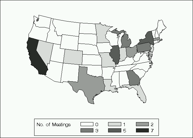
California First: Correcting Encoding Bias in Maps.
Full size (616 x 443; 156K)
(Response from AmStat News)
The history of data visualization shows that these problems in thematic cartography--- showing a response or outcome variable on a map--- have a long history, and many solutions. Some of these: a US Visibility Map, a Chi-Square Map, and Generalized color schemes for mapping are shown on the Bright Ideas page Encoding bias is relatively easy to fix, at least approximately, in this simple example. This revised graph apparently uses a continuous gray scale encoding to portray the number of meetings in each state. Now we can see that California is clearly first in the number of JSM meetings. But note that the gray scale, while ordered, is not perceptually linear with what is to be shown here--- number of meetings. In particular, there is a larger perceptual difference among the levels 0, 1, and 2 than there is among the levels 3, 5, and 7. |
|
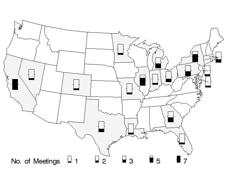
California First: Correcting Area Bias in Maps.
Full size (760 x 571; 11K)
(Re-drawn using SAS)
There are a variety of ways to fix area bias in maps. Most of these attempt to separate the area of the region from the graph symbols used to show the response--- here a discrete, quantitative count. This figure uses a linear scale shown as a vertical bar where the proportion filled corresponds to Number of Meetings/max(Meetings). The states that have counts of 1 or more are lightly shaded, to distinguish them from the states that have had zero meetings. It is not clear that this is the best choice. But note that several Eastern states have areas too small to accommodate the gauge symbol. For readability, these symbols have been moved out into the ocean, with lines connecting them to their state centers. |