DataVis.ca
Michael Friendly
York University

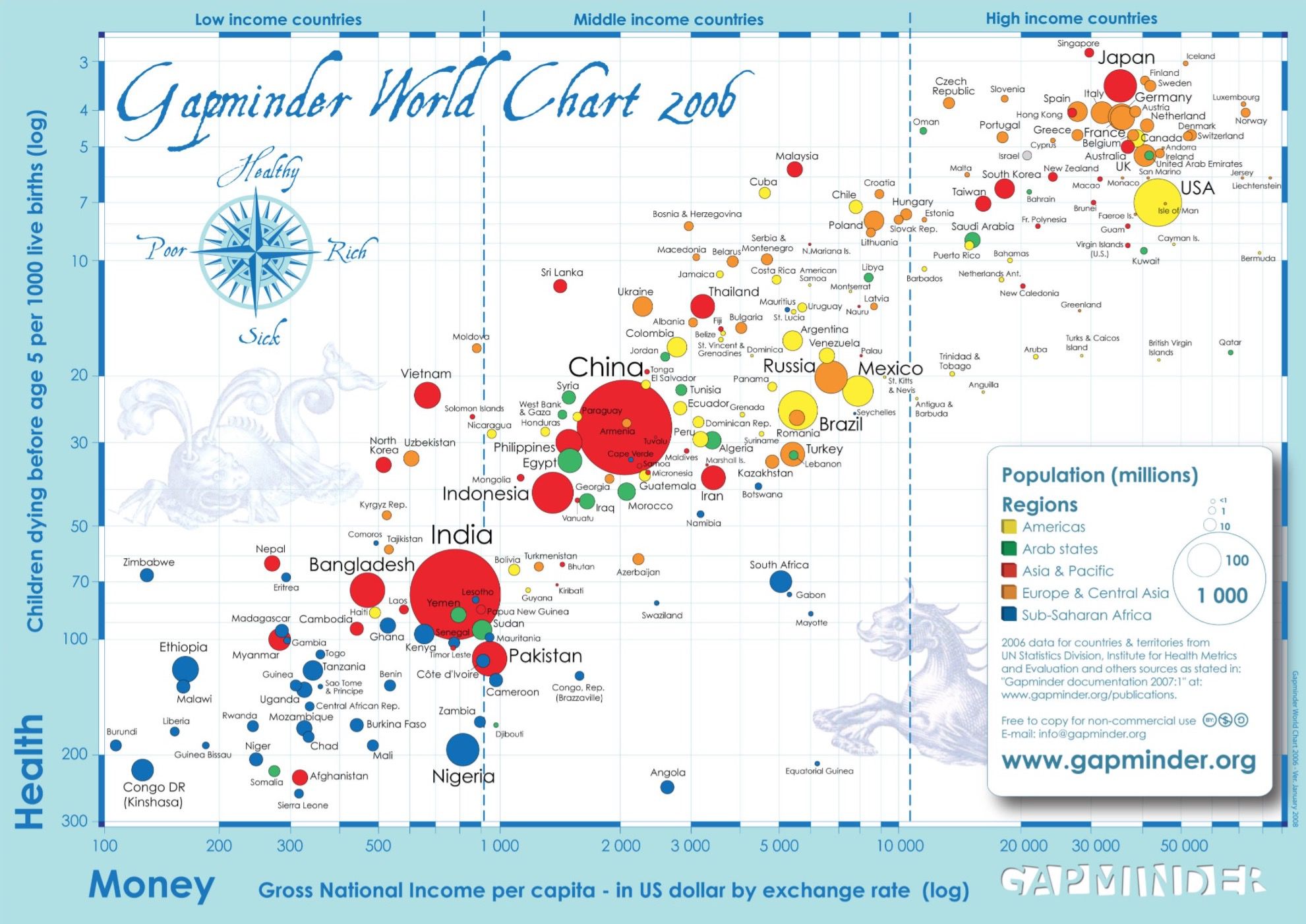
Title: Gapminder World Chart
Author: Hans Rosling
Location: Stockholm, Sweden
Year: 2006
Hans Rosling and others at the Gapminder Foundation in Sweden developed some novel ways to “… increase the use and understanding of information about social, economic and environmental development at local, national and global levels.”
The information was there, in a variety of data banks, but people couldn’t access it or see it. They created the “moving bubble chart” and other methods now widely available on Google and other sources.
The Gapminder World Chart is a poster, designed to conjure the image of an old map, but with dimensions corresponding to the health and wealth of nations. Now they have it online
Take a few moments to study it. What story does it tell? What world regions are poorest and with the worst child health indicator? How is population shown? What countries stand out as being very different than others that might have been similar?
The graphical details of this chart are also quite remarkable.
Source: www.gapminder.org
 Except where otherwise noted, the Gallery of Data Visualization by
Michael Friendly is licensed under a
Except where otherwise noted, the Gallery of Data Visualization by
Michael Friendly is licensed under a Creative Commons Attribution-NonCommercial 3.0 License. Please cite any uses of this work as shown below.
Citation: Friendly, Michael (2001), Gallery of Data Visualization, Electronic document, http://www.datavis.ca/gallery/,