DataVis.ca
Michael Friendly
York University

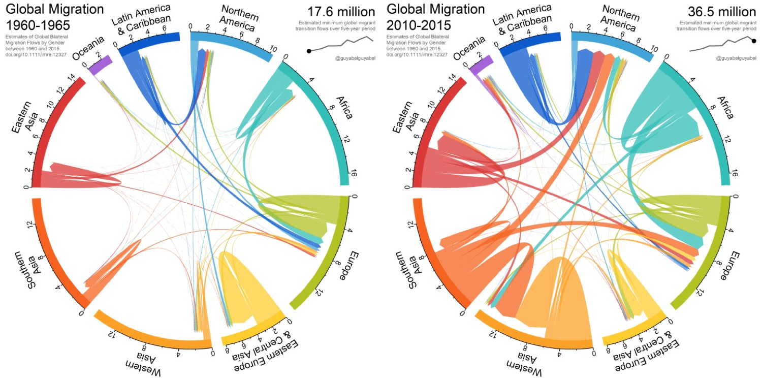
Title: Global Migration, animated with R
Author: Guy Abel
Location: Shanghai, China
Year: 2018
Moving data visualisations are on the rise with the advacement and accessibility of technology. This is a mere snapshot of a chord chart depicting migration patterns between the regions of the world from 1960 to 2015 by Guy Abel at the university of Shanghai. This animated chart was created entirely using the R language.
There is a lot of information depicted here, and it may be difficult to study specific area patterns because of the speed of the movement of the chart in the gif. However, generally speaking, the colours and the thickness of the arrows show that migration all over the world has dramatically increased since 1960. If one pattern is of particular interest, it is possible to follow the pattern for a few rounds while the gif repeats itself.
To see it in action go to: http://revolution-computing.typepad.com/.a/6a010534b1db25970b022ad39d03c1200b-pi
 Except where otherwise noted, the Gallery of Data Visualization by
Michael Friendly is licensed under a
Except where otherwise noted, the Gallery of Data Visualization by
Michael Friendly is licensed under a Creative Commons Attribution-NonCommercial 3.0 License. Please cite any uses of this work as shown below.
Citation: Friendly, Michael (2001), Gallery of Data Visualization, Electronic document, http://www.datavis.ca/gallery/,