Laurels |
|---|
 Visual delights
| Picture | Words |
|---|---|
|
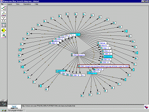
Atlas of Cyberspaces: Mapuccino, Java display of web site
structure full size (1024 x 768)
[29K]
Mapping and the visual representation of information structure has been challenged by the World Wide Web and other emerging Cyberspaces. The Atlas of Cyberspaces project at University College, London provides a visual atlas of maps and graphic representations of the geographies of new electronic territories on the Internet. This image, from the Web Site Maps page shows a fish-eye view of a web site map constructed dynamically by Mapuccino, a Java application for interactive visual maps of Web sites developed by the IBM's Haifa Research Lab in Israel. |
|
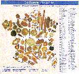
Cartes Gastronomiques: Bread map of France, full size (594 x 554) [79K] Cheese map of
France, full size (599 x 540) [69K]
Not all thematic maps have to have a serious purpose. Cartes gastronomiques were quite common in the early 20th century and many fine examples are held in the Bibliotheque Nationale. I found these examples in a brochure distributed by Coté France on the Autoroute du Sud. Now, what's the shortest distance between a Cantal and a pain de mie?. |
|
Wallpaper Groups
A collection of graphics illustrating the 17 plane symmetry groups with wallpaper patterns, by David Joyce at Clark University. See also: Symmetry and the Shape of Space by Chaim Goodman-Strauss. Xah Lee's Tilings and Patterns site contains a large collection of wallpaper designs based on geometrical motifs, Mathematica software, and links to many other related sites. Mark Phillips' Java Kali lets you draw wallpaper patterns based on any of the 17 plane symmetry groups. |
|
The KnotPlot Site
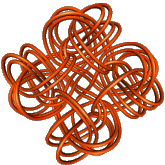
A collection of knots and links by Robert Scharein at UBC, viewed from a (partly) mathematical perspective. The images were created with KnotPlot, a program to visualize and manipulate mathematical knots in three and four dimensions. |
|
Totally
Tesselated
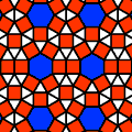
A site devoted to tesselated designs -- space-filling, repetitive pattersn in art and mathematics including some history, mosaics and tilings, Escher, and more. |
|
The
Complete History Of The Discovery Of Cinematography
How can we portray a chronology or history visually? Timelines are usually long (time) and thin (dated information), but there are often multiple layers of information--- text, images, bibliographic references, and so forth. Here is one nice example of a visual chronology--- a beautiful web portrayal of the history of cinematography. See the timelines page for more examples of visual representation of events in time |
|
|
|
Visual proofs (See also the AMS page,
Visual explanations in mathematics )
Proofs are usually dry, dusty stuff sprinkled liberally with symbols. What about proving something with a picture? This proof of the Pythagorean Theorem is attributed to Bhaskara, a Hindu mathematician of the 12th century. We are given the bottom right triangle. Construct a square by making three copies of the triangle, as shown. Got it? The side of the small square is b-a, and its area is (b-a) or b-2ab+a. The area of our triangle is ab/2. The area of all four triangles is 2ab. Then the area of all four triangles, plus the area of the small square is b+a. So c=a+b. |
|
Symmetric Venn diagrams
Venn diagrams are
often used in logic to show intersection relations among sets, but they
are usually limited to being shown as three overlapping circles.
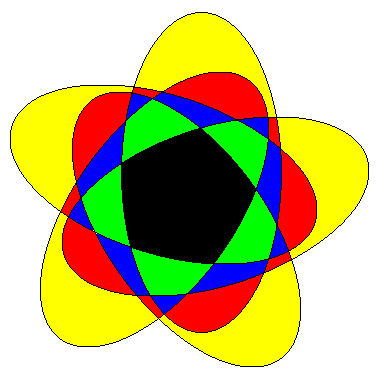
Here is a page that explains a general way to construct symmetric Venn diagrams using ellipses. The example shows a Venn diagram made from 5 congruent ellipses. The regions are colored according to the number of ellipses in which they are contained: grey = 0, yellow = 1, red = 2, blue = 3, green = 4, and black = 5. Note that the number of regions colored with a given color corresponds to the appropriate binomial coefficient: #(grey) = #(black) = 1, #(yellow) = #(green) = 5, and #(red) = #(blue) = 10. The Electronic Journal of Combinatorics has many other lovely examples and visual explanations. |
|
Flag graphs: Meet the World:
[ Brazil ]
[ Colombia ] [ USA ]
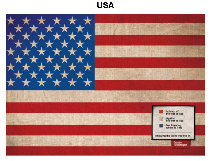
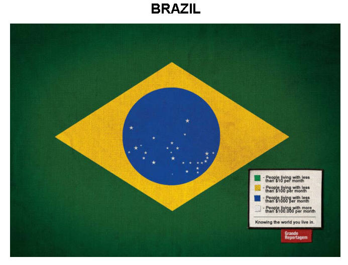
The Brazilian artist, Icaro Doria, designed a series of flag-graphs for countries of the world, using the actual flag as the form and some relevant information as data: We started to research relevant, global, and current facts and, thus, came up with the idea to put new meanings to the colours of the flags. We used real data taken from the websites of Amnesty International and the UNO. |
|
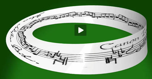
Strange Paths: Bach canon visualization
How to visualize a complex musical score which has an underlying spatial representation? This image, from Strange Paths, is the opening frame of an animation of Bach's Canon 1 a 2. The animation lets you see as well as hear the structure of the piece, which is topologically equivalent to a Möbius strip. From the Strange Paths description: In the enigmatic Canon 1 a 2 from J. S. Bach's "Musical Offering" (1747) (also known as "crab canon") the manuscript shows a single score, whose beginning joins with the end. This space is topologically equivalent to a bundle of the line segment over the circle, known as a Möbius strip. The simultaneous performance of the deeply related forward and backward paths gives appearance to two voices, whose symmetry determines a reversible evolution. |
|
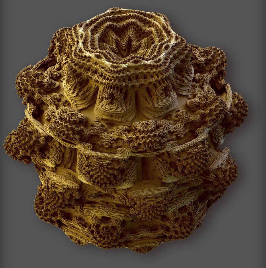
Mandelblubs: 3D Fractals
Full size (928 x 934; 216K)
Description: For those of you who are fans of fractals, Mandelbulb: the 3D Mandelbrot fractal is an amazing website. The original Mandelbrot 2D fractal is an amazing mathematical and graphical object that has captured the public's imagination for 30 years, and it has been an open question of whether there exist 3D analogs. Daniel White has developed a 3D analog of the Mandelbrot figure (a "Mandelbulb") and produced some pretty incredible pictures of its infinitely detailed surface.
[Credit: Thanks to Chris Green for bringing this to my attention.]
|


