DataVis.ca
Michael Friendly
York University

Laurels |
|---|
 Bright ideas
| Picture | Words |
|---|---|
 |
Jacques Bertin . Larger image (156x240)
No Gallery of Data Visualization can be complete without paying tribute to Jacques Bertin, whose monumental Semiology of Graphics (1983) systematically classified the use of visual elements to display data and relationships. Bertin's system consists of seven visual variables: position, form , orientation, color, texture, value, and size, combined with a visual semantics for linking data attributes to visual elements. See Colloquium on 30 years of Semiologie Graphique for a recent retrospective appreciation. |
  |
The reorderable matrix. . Initial, unordered table (300x116)
[3k] Reordered table
(300x142) [3k]
[Source: Bertin (1981), Graphics
and Graphic Information Processing.]
Data are often presented in a table or chart whose rows and columns are intrinsically unordered, but which are arranged in an order which conceals patterns, rather than reveal them. The top figure shows a classification of townships (columns) by binary characteristics (rows, presence or absence), both arranged in arbitrary order. Can you see any patterns or trends? One of Bertin's graphical methods consists simply of permuting the rows and columns to place similar rows and columns together. This gives the bottom figure, where now the trends are clear. See also: Harri Siirtola's The Reorderable Matrix (Java 1.1 Applet, + you need Swing) for an interactive demo. Here is a local copy of a nice dynamic display of the reorderable matrix from a site, Bertin, Semiologie Graphique, that no longer exists. |
 |
Tableplots. Full-size image (354 x 321; 85K) Brief description of tableplots Tables are good for looking up information, but are notoriously inadequate for understanding trends in numbers. This is particularly so in factor analytic research, where the results (factor loadings, etc.) are invariably presented in tables. A tableplot (Kwan, 2007) is a display that supplements each cell of a table with a symbol proportionate to the |cell value|; black circles for positive values, red diamonds for negative values. This figure superimposes the tableplots of two factor patterns from a study by Linehan et al (2006), greatly facilitating the assessment of replicability. The display is also augmented with a row (column) of identity coefficients (in yellow) that quantify the degree of replicability in the cell values for a variable (factor) across the two tables. |
 |
Boxplot of the NJ Pick-it Lottery. Full size (640x495) (from the S-PLUS
book)
An important principle of graphical display is to focus the viewers attention on what should be seen in the data. Tukey's boxplot suppresses all detail in the middle of a distribution, but displays individual observations in the extremes, where they may need to be noticed. This boxplot shows the payoff of winning numbers in the New Jersey Pick-It Lottery, grouped by leading digit of the winning number. Players pick a 3-digit number, and the payoff is divided by the number of winners. The graph shows clearly that payoffs for numbers 000-099 are substantially higher, presumably because fewer people picked numbers less than 100. |


|
Hanging rootogram Ordinary histogram: Full size (427 x 319) [3K].
Hanging rootogram: Full size (427 x 319) [3K].
Description: Comparing the distribution of data with a theoretical distribution from an ordinary histogram is difficult because: (a) small frequencies, usually in the tails, are dominated by the larger frequencies. (b) it is hard to perceive the pattern of differences between the histogram bars and the curve. John Tukey suggested the Hanging rootogram to solve these problems. In this plot, (a) the frequencies are plotted on a square-root scale, to make the small frequencies relatively more prominent. (b) the histogram bars are moved up to the curve, so that we may judge the differences more easily against a horizontal line. The data here are frequencies of occurrence of a word in a series of texts, and a Poisson distribution had been fit. It is easy to see in the hanging rootogram that the distribution differs systematically from a Poisson. |

|
The Bagplot: A Bivariate Boxplot. Full-size image 411x421 (4k) From
Peter Rousseeuw, Ida Ruts and John Tukey The Bagplot: A Bivariate Boxplot, Figure
1.
The univariate boxplot has been widely used since proposed by Tukey around 1971. Tukey (1975) also suggested a multivariate generalization of depth of an observation on which the boxplot is based, but no implementation of this idea had been available until quite recently. [Others had earlier suggested peeling the convex hull, but this doesn't quite get it right. Multivariate depths does, but is computationally intensive.] Peter Rousseeuw and Ida Ruts worked out the bivariate extension, called a bagplot, illustrated here. The large + marks the bivariate median. The dark inner region (the ``bag'') contains the 50% of the observations with greatest bivariate depth. The lighter surrounding ``loop'' marks the observations within the bivariate fences. Observations outside the loop are plotted individually and labeled. |

|
US Visibility Map, Full size (531 x 335)
Data maps, particularly of the United States, are difficult to do because the area of each geographic unit serves as the visual container for the data to be displayed; our visual understanding of the data is confounded with the geographic boundaries. One solution, suggested by Mark Monmonier (How to Lie With Maps), is to use a schematic map which partially equates the areas of geographic regions. The resulting Visibility Map sacrifices some visual fidelity in state boundaries, but helps the viewer see the symbols for small states like Rhode Island and Delaware. |

|
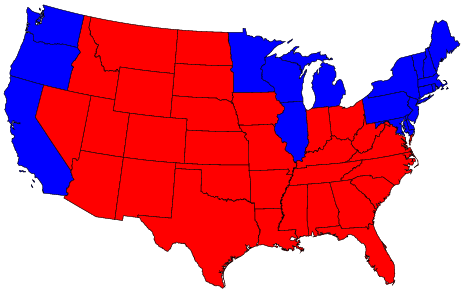
Anamorphic US Election Map, Full size (2357 x 2021;751K)
Sometimes a map wants to be the forground rather than the background for a data display. Anamorphic maps deform the map for this purpose, This map from the New York Times shows the state of the U.S. presidential race from polls conducted before the 2000 election. In order to show the contribution of each state to a victory by Bush or Gore, each state is sized according to the number of votes it has in the Electoral College, with one square for each vote. A 5-level color scale distinguishes ``safe'' from ``leaning,'' and a bar graph at the bottom shows the totals for all states.
[Source: Presented by Archie Tse in a
session on Information Graphics at the 2002 Joint
Statistical Meetings, Aug. 12, 2002.]
|

|
Chi-square Map. Full size (420x348) [14K] and
with circle-cartogram (550x257) [48K]
(from Maps of the Census: A Rough Guide,
by Jason Dykes and David
Unwin)
There are many difficulties in showing rates of incidence or proportions in maps, when both the areas of geographic regions, and the populations in those regions vary, often inversely. In spatial epidemiology, for example, Standardized Mortality Ratios are often used, expressing the ratios of the number of deaths in each area to those expected on the basis of some externally specified (typically national) age-sex specific rates. This figure uses a Chi-square metric to depict the distribution of number of cars, O, in each ward in Leicestershire, UK, expressed as a signed chi-square contribution, (Oi - Ei)/ Ö Ei, relative to the expected number, E, per capita. A diverging colour scheme applies hues of red and blue to those areas with higher and lower than expected values with colour saturation showing the magnitude of the variation. Thus whiter zones are close to the expected value and deeper blues and fuller reds show the extremes. This map still confounds area and population with visual impact, which the use of a cartogram base, with circle areas proportional to the population, helps avoid. |
|
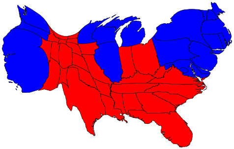
Density-equalizing cartograms: US 2004 election.
Standard election map, Full size (464 x 291; 31K);
Equal-density cartogram, Full size (476 x 302; 33K); See:
Maps and cartograms of the 2004 US presidential election results; also:
Isodemographic map of the 1997 Canadian Federal election results
(Image: Isodemographic map (500 x 398; 14K) )
In the standard US election map, states are colored red or blue to indicate whether a majority of their voters voted for the Republican candidate (George W. Bush) or the Democratic candidate (John F. Kerry) respectively. This is highly misleading because it fails to take into account the fact that most of the red states have small populations, whereas most of the blue states have large ones. The blue may be small in area, but they are large in terms of numbers of people, which is what matters in an election. The equal-density cartogram corrects this impression by scaling the size of each state according to its population. Here, for example, the state of Rhode Island, with its 1.1 million inhabitants, would appear about twice the size of Wyoming, which has half a million, even though Wyoming has 60 times the acreage of Rhode Island. The idea of a cartogram is relatively simple, but constructing one that also preserves the shapes of regions is non-trivial. Recently, Michael Gastner and Mark Newman devised a general algorithm for this purpse, described in Proc. Nat. Acad. Sci., 101, 7499-7504 (2004). The Maps and cartograms of the 2004 US presidential election results web page shows a number of other variations. |

|
Multivariate comparisons of means. Full size (504x433)
It is difficult to compare the means of several groups on many variables. Profile or parallel coordinate plots are often confusing when the curves for different groups cross a great deal. The multivariate star plot shows each of an arbitrary number of variables on radial axes from the origin, here for the means of automobile models, classified by region of manufacture. In this plot, the variables Price, Gear Ratio and Turning Circle are reflected so larger values represent "better" for all variables; then all variables are first scaled to a 0-1 range. Variables are arranged around the circle by a multivariate effect ordering according to their order on the largest discriminant dimension. The error bars next to each radial axis shows the smallest value of a difference between means required for a (univariate) .05 significant difference. |

|
Enhanced scatterplot matrices. Full size(349 x 279; 5K)
The scatterplot matrix displays the relationships among all pairs of many variables. This example shows the relation among three measures of social competence, but the data in each plot are stratified by the type of setting. To aid perception of how the relations differ across setting, each subplot is enhanced with a data ellipse showing the strength of the relationship. The diagonal panels show the univariate distribution of each variable, again stratified by type of setting. Color is used effectively to keep the settings visually distinct. |

|
Tile Maps for Temporal Patterns Full size (469x602) [18K]. From
Mintz, D., Fitz-Simons, T. & Wayland, M. "Tracking Air
Quality Trends with SAS/GRAPH", SUGI 22 Proceedings,
807-812.
Description: The tile map is a useful semi-graphical display for data with seasonal variation. One square (tile) is plotted for each day of the year; the color of the tile shows the level of Ozone concentration in Los Angeles for that day, with lighter shades indicating lower concentration and darker shades showing higher concentrations. (Ed. note: This is true of the B/W version in the printed paper, but not true of the color version shown here, which uses 'elevation mapping' of colors to ozone concentration. The rendition in color is not exemplary.) The figure shows the data for the 10 years, 1982 - 1991. Within each year, ozone concentrations are higher in the summer months; Over years, the concentrations in the summer months have decreased. |

|
Animated Triplot From Graham Wills, EDV
Baseball Example [Full-size
image 351x554 (41k)]
Interactive visualization tools are more powerful than static graphics because they allow information in two or more displays to be "linked", so that information selected in one display is automatically selected in all others. Animation takes this idea one step further: The categories in one graph are selected cyclically, showing an additional dimension over time. This image, from Graham Wills' Exploratory Data Visualizer shows an animation of data on baseball players' fielding performance. The top panel is a triplot of the variables Errors, PutOuts, and Assists. Players who have an exactly average ratio of the three variables to each other will be drawn in the center of the triangle. If they have more of one variable, then they will be closer to that variable's corner of the triangle. The bottom panel is a bar chart coding player's fielding positions. The separation into two groups in the triplot shows that there are two different types of fielders; there is a strong distinction between fielders with many PutOuts and those with many Assists. The animation shows how the distinction depends on the player's position. |

|
Discrete data. Full-size image 640x480 (6k)
From John Fox's
Applied Regression Analysis, Linear Models, and
Related Methods, Figure 15.1. Discrete,
categorical data presents difficult challenges for
graphical display. It is hard to show the data, because
many points coincide
This graph shows a scatterplot of data from a survey of Chilean voters held six months before the plebicite held in September 1988 on the future of the military government of Augusto Pinochet. The ordinate, "Voting Intention" is a binary variable, 0 = No = Return to Civilian government, 1 = Yes = Continue Military rule. The abscissa reflects a scale of Support for the Status Quo. The graph shows the binary observations at the top and bottom of the display, jittered vertically to avoid overplotting. The solid line is a linear regression; the solid curve is a logistic regression. A non-parametric (lowess) curve is shown by the broken line. Although there is no data in the middle of the graph, the visual elements combine to show how the propensity to vote Yes increases steadily with Support for the status quo. |

|
Interactive mosaic plots. Full-size
image 538 x 382 (60k)
Categorical data are often shown as tables of frequencies, cross-classified by two or more discrete variables. Interactive mosaic plots can display complex multivariate relationships surprisingly clearly. Interaction is essential to query the displays (because axis descriptions become messy in several dimensions) and to reorder the displays to emphasise different features. This plot, from the Augsburg MANET software, shows survival rates by gender, age and class from the Titanic disaster. The left lower section shows how female adult survival rates declined with class and the right lower section reveals that the pattern of male rates was different. Reordering by class, age and gender would highlight the comparison of male and female rates by class and the poor survival rate of children in the third class. [Thanks to Antony Unwin for this contribution.] |

|
Corrgrams Full size
(397 x 419) [24K]. From Friendly, M., ``Corrgrams: Exploratory
displays for correlation matrices'' (2002).
Description: Correlation (and covariance) matrices provide the basis for all (classical) multivariate statistical techniques, but most of these compress the correlations into a low-dimensional summary. How about a direct graphical display? The correlogram uses two general techniques: The figure shows the correlations among 12 measures of 74 automobiles from the 1979 year. Such displays are implemented in the corrgram package in R. |

|
Generalized color schemes for Mapping and
Visualization Full size (476 x
298) [6K]. From Cynthia Brewer,
Color Use Guidelines for Mapping and
Visualization.
Description: Appropriate use of color for data display allows interrelationships and patterns within data to be easily observed. The careless use of color will obscure these patterns. When color is used 'appropriately,' the organization of the perceptual dimensions of color corresponds to the logical ordering in the data. Brewer develops a color scheme typology which matches the ways in which data are organized with corresponding organizations of hue and lightness. Four types of color schemes are represented. The image also illustrates how they can be used in combination for two-variable maps or visulizations.
|

|
Timelines. Full-size image
288 x 400 (101k)
How can you show the details of a history visually? Time provides one obvious dimension. What else can you show to tell the story? Most timeline charts use a 2D representation, time x {place or theme}. Some are more successful in integrating additional dimensions. This image, from the Library of Congress, Visual Memory Project, History of the Civil War in the United States, 1860-1865 shows the progress of the war, with a time scale in months, and principal battles, troop movements, etc, using "Scaife's comparative and synoptical system of history applied to all countries." A reproduction may be purchased from the Kroll Map Company See the timelines page for more on timelines. |

|
Spie chart -- a comparison of two pie charts.
Full-size image
(350 x 207; 14K)
The crusty pie chart gets a new topping! A pie chart depicts a partition. A Spie chart combines two pie charts to compare partitions. One pie chart is drawn as-is, and serves as the basis for comparison. The other is superimposed on the first, using the same angles for the slices, but different radii, so as to achieve the desired areas. The example shows road casualties data from Israel. The base pie chart shows the general population parititoned into gender and age groups. The superimposed chart shows the same partitioning for the population of road casualties. Obviously the main age group hit is 20--24, and males are much more often involved in accidents that females. Reference: D. G. Feitelson, "Comparing Partitions with Spie Charts". Technical Report 2003-87, School of Computer Science and Engineering, The Hebrew University of Jerusalem, Dec 2003. URL: http://www.cs.huji.ac.il/~feit/papers/Spie03TR.pdf |

|
Network visualization: Force-directed layouts
Full size (204 x 266; 32K);
Protovis example
Description: "Graph drawing" is a huge area comprising many methods for drawing graphs of nodes and edges representing relationships among some entities. Networks can be quite large, and one key problem is how to layout such a diagram with minimal overlap between nodes. There are many bright ideas in this area, and this is just one. The diagram shown (an example for Protovis) is a network representation of character co-occurrence in the chapters of Victor Hugo's classic novel Les Misérables. The node colors indicate cluster memberships. The 3D diagram is constructed by a force-directed layout algorithm that treats nodes as charged particles that repel each other, and links as dampened springs that pull related nodes together. A physical simulation of these forces then determines node positions. (Protovis has now been superceded by D3, a javascript library for data-driven documents.) |
|
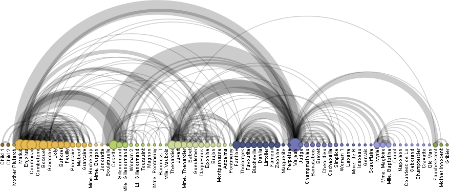
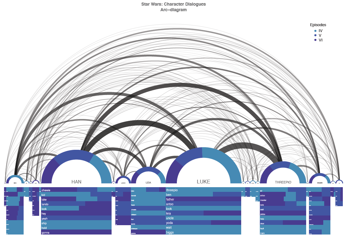
Network visualization: Arc diagrams
Full size (204 x 266; 32K);
Protovis arc diagram example;
Star Wars arc diagram (1110 x 761; 255K)
Description: An arc diagram is a graphical display to visualize graphs or networks in a one-dimensional layout. The main idea is to display nodes along a single axis, while representing the edges or connections between nodes with arcs. The first diagram shown (an example for Protovis) is a network representation of character co-occurrence in the chapters of Victor Hugo's classic novel Les Misérables. The node colors indicate cluster memberships. The second is a visualization of characters in Star Wars, produced with the R package, arcdiagram. |
|
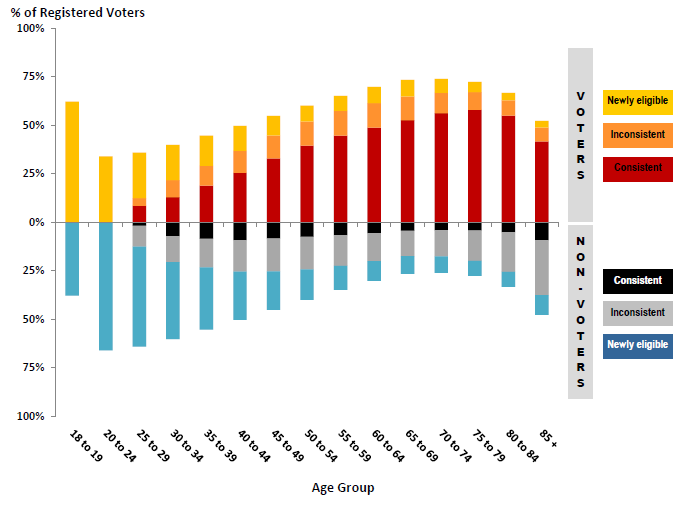
Voting Demographics: Making the complex understandable
Full size (693 x 523; 25K);
Description: Government statisticians often have the task of analyzing large masses of data and making their results comprensible to politicians and the public. Many statistical models may be fit, but then the job becomes one of presenting some key findings in an attractive and easily understandable way. The difficulty for graphical presentation arises when a result involves several factors and standard graphic forms must be modified to show a conclusion easily. This example (one of many that could be chosen from this and other sources) comes from a study on voting behaviour (Who Heads to the Polls?) by Joanna Burgar and Martin Monkman in the 2009 provincial general election for BC Stats, the central statistical agency of the Province of British Columbia in Canada. Voting data was available for all registered voters for elections in 2001, 2005 and 2009. Of the nearly 3 million registerd voters in 2009, an attempt was made to analyze voters and non-voters in relation to their past voting behaviour. The graph displays the percentage of registered voters in 2009, classified by whether they voted or not, by age, and their past voting --- consistent, inconsistent or newly elligible to vote. Except for the 18-19 age group, the proportion of voters increases with age up to age 80. Among voters, it is clear that the proportion who consistently vote also rises with age. |
